WATERVIEW HOUSE KITCHEN
VIVIAN PANAGOS - INTERIOR DESIGN
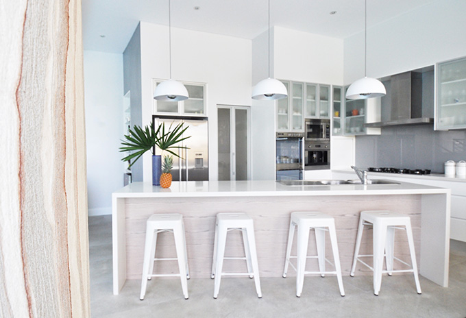
Hello there! I am still in cyberspace - mainly checking in from time to time but mostly I am working on design projects away from the screen. Life is jam-packed at the moment but I wanted to pop by and share with you the 'final' photos of a project I worked on a while ago (four years ago now!). You will have already seen the progress photos but just to re-cap: The Waterview House is a magnificent architecturally designed property overlooking the water and surrounded by bush. I worked with the family to select furnishings for the new home. This particular part of the project was to specify materials for a newly designed kitchen. I presented options for everything from the benchtop, cabinet and island materials, backsplash, wall paint, lighting and stools. |
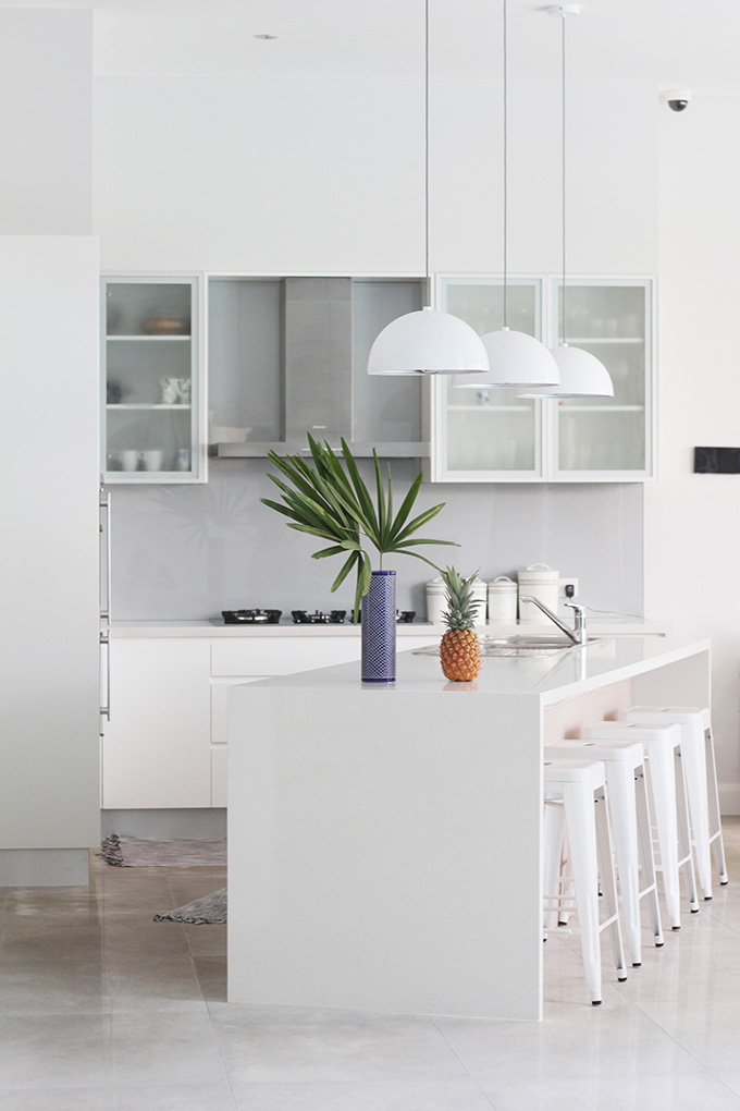
The inspiration for the colour palette were the architectural columns in the open living and dining spaces. You can see it in the photo below in the foreground - it has lovely red-brown and grey veining.
We selected white as the base colour for the kitchen. This included the base cabinets, benchtop, island stools and lighting. To soften the all-white look, we added a metallic backsplash which gives a lovely grey finish. The walls were painted a light grey and a beautiful antique oak wood veneer was selected for the kitchen island and bar. The veneer was laid horizontally in one continuous strip and has lovely veining throughout. We even added a playful touch to the kitchen with bright red bar stools. If you would like assistance with your new kitchen project or home, feel free to contact me about my design services. |
![]() ![]() ![]() |
Tuesday, July 7, 2015
WATERVIEW HOUSE KITCHEN
Monday, July 15, 2013
CLOUD lighting installation
CLOUD sculpture installation at Nuit Blanche Gallery
Taking time off from various projects, including ish and chi, has been nice but I have missed writing. I needed to recharge before the new college semester resumes because these next few months will be my last and the most stressful! So I have been conserving my energy and now I have a heap of it to unleash onto you, you have been warned! Let's get back into it...

CLOUD CEILING installation at Progress Bar
Maybe you have seen the CLOUD project? It is the creative idea of artists Wayne Garret & Caitlind r.c. Brown who suspended 5000 burnt-out incandescent light bulbs in the shape of a cloud and illuminated the bulbs at the pull of a string with spectacular results! The team behind this temporary installation have now created a permanent cloud installation called the CLOUD CEILING at the Progress Bar in Chicago.
Thursday, June 6, 2013
Seeing squares
It is a little hard to breath right now. Next week I will be half way through my final year and it is a mad rush to complete projects. And there is so much else happening too including speaking at Vivid Ideas for Blog Society this weekend. You bet I'm excited! I think I must be one of the rare few that enjoy speaking in public even with the butterflies. Will you be there?
PS. I'm really digging these images right now and they are forming part of the basis of my concept for my final year exhibition stand. The bottom image is from a house / art installation designed by Jean Pierre Raynaud in 1974 comprising entirely of white tiles. More images can be found via this link.
Thursday, May 30, 2013
Light and reflection: Drawing inspiration from the runway
"She glides into view, as if cutting through water, sleek, shimmering, statuesque" - Bec & Bridge, Chromolux 2013
Bec & Bridge's Chromolux runway show caught my attention tonight after a friend shared these photographs. The collection draws inspiration from the sea with a fishscale print that recurs through the designs and the incorporation of soft colours and fluid lines.
Fashion aside, it is the transfer of the collection's concept to the execution of the runway show that blew me away.
Wednesday, April 24, 2013
MAH Collection: Blending science, art and fashion
A friend visited from Singapore last year and we caught up while she was in town. The conversation was naturally about all things creative. Ondina is an interior designer and we studied together for a short while before she moved overseas. She was working on launching a new fashion label and I was inspired by her enthusiasm and ideas.
Wednesday, April 17, 2013
Repetition
Today, I'll be honest, I just want to put this up here.
I'm working on a project, trying to incorporate repetition in various ways. This is one image I have used for reference. And this is another: the Lisbon Orient Station. There is beauty in repetition.
Monday, March 11, 2013
Painted Ladies in San Francisco
Today we are moving away from mid-century design to the Victorian era and the second most photographed location in San Francisco (this is the first).
The Painted ladies are a row of Victorian houses painted in pastel shades that enhance their architectural details. I hadn't heard of them prior to seeing them in San Francisco but I realise now why they looked familiar - they were in the opening credits of the TV series 'Full House'.
Did you watch the show? Do the houses look familiar to you?
Monday, October 22, 2012
Colourful space: Secret tea shop
This tea shop in Sao Paulo is 25m2. Designed by Brazilian architect Alan Chu, the shop features coloured panels that pull and swing out to reveal the shop.
Friday, March 30, 2012
The vibrant home of Karim Rashid
Hello friends, I am feeling better and it helps to surround myself with bright and bold colour to cheer me up and feel better again. Enter Karim Rashid.
Saturday, February 25, 2012
Pecha Kucha
Fun assignments are my favourite. We have been asked to choose 10 inspirational images and we are given 10 seconds to explain the relevance of the images to ourselves as designers. Awesome, right? But how do you choose just ten??
I have chosen my first though. The entrance to The Parker.
What would you choose for your first image?
♥ Images The Parker Palm Springs
Monday, February 20, 2012
Inspiration for a restaurant
These images are from a New York restaurant called Sweetiepie. I believe Sweetiepie is now closed but these images serve as beautiful inspiration for a restaurant I hope to one day own.
Thursday, January 12, 2012
Jayne Mansfield's Pink Palace
Let's take a step back in time shall we? To 1957 when Hollywood celebrity Jayne Mansfield purchased her home in Sunset Boulevard for $76,000, painted it pink, filled it with cupids, had a heart shaped bathtub installed and filled the fountain with pink champagne. Oh, and she also had her future husband build her a heart shaped pool because she refused to marry him otherwise... or so the story goes.
Wednesday, December 7, 2011
Mid-century Modern

I'm writing this post at 1am. I can't sleep.
So instead I have been burying myself in images of mid-century modern homes because I suppose that is what you do if you are design obsessed with nothing else to do?
This weekend I am attending an open inspection for a 1950s home that has popped up for sale in my area. I must say I have been toying with the idea of moving for a little while. Not sure if I can bring myself to actually make the move because I love my cottage home so much but a change does sound good too. Who knows? I may fall in love this weekend.
To see more of this home above, visit Apartment Therapy.
Thursday, November 10, 2011
Bathroom Tiles

I still have my bathroom update on my mind and just when I thought I was settled on a choice for floor tiles I came across this image in the latest issue of Madison magazine. The beautiful bathroom is in the Balinese home of fashion designer Natasha Welsh.
The floor tiles are traditional Javanese tiles and the contrast of the pattern with the white of the bath tub, mixed with old wooden furniture is really lovely. And the plants! A bathroom needs plants.
Tuesday, October 4, 2011
More breeze blocks


I am still editing the photos I took on my iPhone from my little trip to Brisbane last week. Looking forward to sharing with you.
In the meantime, while researching Queensland architecture I came across Building the Ville - a blog of architecture in Townsville, Queensland. My favourite house is this one pictured.
I STILL love breeze blocks. Do you?
(Image credit Building the Ville)
Wednesday, September 21, 2011
Colour blocking in architecture

Once upon a time, I admit, I muttered the words: Architecture. I just can't get myself interested in it?!
And now? Obsessed.
The latest building I have fallen for is this one designed by Emmanuelle Moureaux, Tokyo based French architect and designer, and it takes the idea of colour blocking to new heights (literally).
Tuesday, August 2, 2011
Thursday, June 16, 2011
An apartment alive with colour

If you are not a fan of colour you may need to wear sunglasses to read this post because WARNING - there is lots of it to see here!
Designed by Swedish architectural company Tham & VidegÄrd Arkitekter, the HumlegÄrden Apartment combines a colourful parquetry floor with bold white furniture for contrast. The furniture looks surreal in this setting.
Wednesday, February 16, 2011
Inspired

This morning I was lucky to be able to take time off work to sit in on a seminar about design and colour with speakers George Freedman of PTW and Greg Natale. Hearing about their vision, the challenges and seeing their work and the magic - I was inspired and left with my head buzzing and full of ideas. Isn't it wonderful when that happens? Has that happened to you?
Thursday, November 11, 2010
Bathroom inspiration

I came across this image over at Kirsten's blog Simply Grove and have been thinking about it today, wondering why the room has struck a cord with me. It is the combination of the old metal lockers, with the traditional style tan chair, the exposed brickwork and wide floorboards which are all unexpected features of a bathroom and work nicely with the white subway tiles.
The real feature of the room though is the bath in the very centre. Oh, to have the space!
(Image via Simply Grove)