__________________________________________________________

About

Portfolio

My Home

Work With Me

Tours

Interviews

Creative Spaces

Style

Monday, August 26, 2013

Cabinet bar inspired by Gaudi


Well it seems I might need to plan a trip to Portugal soon after seeing the images of this Portuguese fishing village that I shared last week and now coming across this eccentrically colourful cabinet bar by Portuguese company Malabar, called Templo. The Gaudi inspiration is pretty clear to see and the rich blue capitonné padding of the interior is lovely combined with the small gold buttons.

Set onto a warm wood base, this cabinet is a real head turner I think! Definitely not a piece to shy away in the corner of a room.

Wednesday, August 14, 2013

Costa Nova do Prado

Fantastic seaside homes in Aveiro, Portugal, photographed by Romanian photographer Dacian Groza. With their candy colour stripes this fishing village looks like it would be a fun place to holiday and the brightly painted houses stand in contrast to their pale surroundings.

Thursday, December 13, 2012

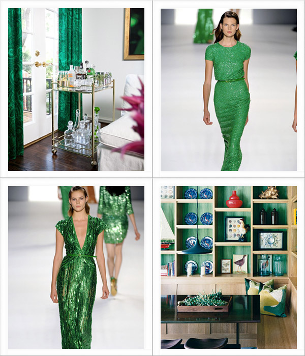
Pantone has announced the 2013 Colour of the Year

And it is Emerald Green.
(Clockwise: 1, Elie Saab RTW 2012, 3, Elie Saab RTW 2012, 4)

More specifically Pantone 17-5641 Emerald. I think this is one of my favourite choices yet as I've been planning to introduce green into my home decor.

Continue to see more emerald green inspiration...

Saturday, November 10, 2012

Paint on photographs {Leslie David for Please! Magazine}

(I've been feeling a lot like this lately)

I'm on the mend thankfully from my accident earlier in the week and wish to thank you for all your kind messages and emails. I'll be okay and back in action very soon.

Thursday, October 25, 2012

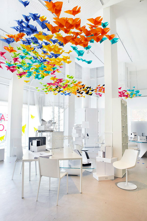
Colour idea for your home: Origami butterflies

Origami butterlies flying through the air. They look magical in this space, don't you think? They were created for the Saturday InDesign trade event which started in Sydney in 2003 and is now held in Singapore as well.

Tuesday, October 23, 2012

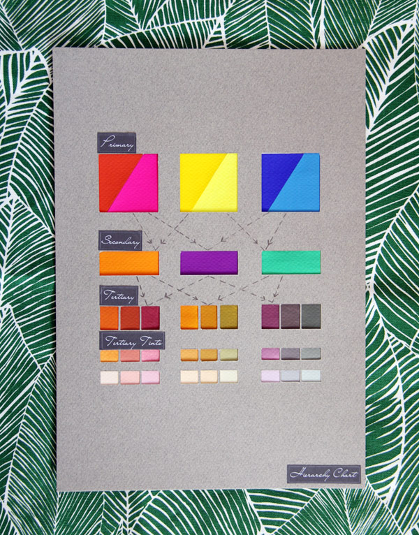
Studying primary, secondary and tertiary colours

Yesterday I wrote about the colour wheel and today I thought we could explore colour a little more and to look at primary, secondary and tertiary colours and how they are applied to interior spaces.

You may have studied colour previously. Please forgive me if I am going over anything that you already know.
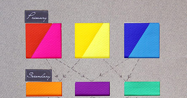
 These are my handpainted colours (yep, more late nights and coffees to do these). 

The top row are the primary colours as seen on the colour wheel. From left to right: warm red, cool red, warm yellow, cool yellow, warm blue, cool blue.

Read on to see more...

Colour idea for your home: Sun umbrellas

Since completing our new outdoor space we have become obsessed with outdoor products. Over the weekend David and I visited Top 3 by Design and it took me every ounce of strength to resist taking one of these sun umbrellas home with me.

They are made by Basil Bangs and we were told they are tried and tested for the Australian sun so the colour shouldn't fade. My personal favourite is the one with the fringe edging. There's just something a bit nana-ish about it that I'm crazy about.

If you prefer your outdoor umbrellas to be less bold there are black and white striped versions as well which are lovely.

Which umbrella is your favourite?

Monday, October 22, 2012

Colourful space: Secret tea shop

This tea shop in Sao Paulo is 25m2. Designed by Brazilian architect Alan Chu, the shop features coloured panels that pull and swing out to reveal the shop.

Studying the colour wheel

Before we delve too far into the world of colour I thought it would be nice to take a little look at the colour wheel.

In a colour theory class we were asked to hand paint individual colours. It was one of the longest exercises we have been asked to do but also the most satisfying. There is nothing quite like hand mixing individual colours to really make you focus on the colour itself.

The above photograph is of my hand painted colour wheel. We also looked at the application of colour in interior spaces. There is so much to learn about colour. I feel as though I could study it for a lifetime and still have more to discover.

Let's have a closer look:

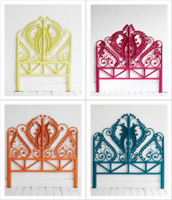
Colour idea for your home: Peacock bed heads

In my dream island home I'll have a bedroom with well worn floorboards, white washed walls, a timber ceiling, large windows with views to the sea, a large comfortable mattress and a brightly painted peacock bed head. Oh yes I would! What would you have?

One week. Lots of colour.


Hello! Did you have a lovely weekend?

The weather shone all weekend here in Sydney but I resisted going to the beach. It isn't that I don't like the beach. I like the water to be really, really warm. We still have some weeks to go before I'm brave enough to test the water temperature.

So I drove around the city taking in all the springtime goodness. All the flowers are blooming in my neighbourhood and my camera is full of floral colour. It's a nice time of year, isn't it?

And speaking of colour, I thought it would be nice to dedicate this week to colour. I'm looking forward to ish & chi becoming an explosion of hues for interior and exterior inspiration. Whether you like colour or not there may be an idea or two for you by using softer tones.

So let's get started shall we? x

Tuesday, May 8, 2012

Colourful streets

Guess what! I found a website all about colour. HEAVEN. It is called Plenty of Colour and written by Chloé, a designer based in Vancouver who seems to be as obsessed with colour as I am. We are going to be buddies in the future I can see it.

The above collection is derived from images from her blog that I was inspired by. I look at the streets of Sydney and see grey, beige, white and variations of these. The above streets are full of colour. I know that councils can play a part in exterior colour selections but wouldn't it be great to live in a street lined with homes in brightly painted hues?

Tuesday, April 17, 2012

Colour inspiration: Bronze, blue and white

I have been immersed in colour lately finding the perfect combination for decorating a new home. The client has asked for help with selecting rugs, cushions and other soft furnishings. I had an idea of which direction to go in and then this morning I was rearranging the above items in my home and here it is! The perfect colour combination of white, grey (already existing in the home), bronze and a deep blue.

Monday, October 17, 2011

Colour Burst: Paris circus

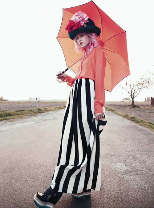
I adore this fashion shoot by Paul Schmidt for Jalouse June/July 2011 for a few reasons - it features pink haired model Charlotte Fee, it has a circus feel and you know how much I love anything circus related and also the colours are beautiful.

Wednesday, September 21, 2011

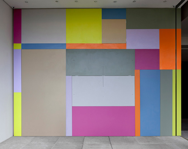
Colour blocking in architecture


Once upon a time, I admit, I muttered the words: Architecture. I just can't get myself interested in it?!

And now? Obsessed.

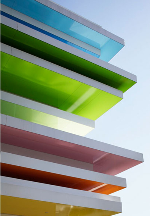
The latest building I have fallen for is this one designed by Emmanuelle Moureaux, Tokyo based French architect and designer, and it takes the idea of colour blocking to new heights (literally).

Thursday, June 30, 2011

Colour Burst: Pale and inky

For the first Colour Burst feature I was going to post an image full of colour but after this post I thought I would be polite and tone it down a touch.


Paint chip colours (L-R): Porters Paints Frieda, Birthday Candle, Pretty in Pink and Sand

This colour scheme might look beautiful in a bedroom. Here's how I would work with it:

Tuesday, January 4, 2011

Pantone 2011 Colour of the Year


Honeysuckle.

Courageous. Confident. Vital. A brave new color, for a brave new world. Let the bold spirit of Honeysuckle infuse you, lift you and carry you through the year. It’s a color for every day – with nothing “everyday” about it.


I would mix this colour with greys, ivories or paler shades of pink and add little accents here and there.

How might you wear or live in this colour?

(Image top: Pantone, bottom: net-a-porter & via Let's Indulge)

Sunday, June 20, 2010

Colour inspiration


My apologies for the infrequent posts of late. I have had lots to do as well as a sick little boy to take care of. Once this week is over, things should settle down with all my assessments done and submitted.

I wanted to give you a little glimpse of what I have been up to. Above is a colour study I have been working on. The project involves drawing inspiration for a springtime colour palette and exploring the colours in each image.

Yellows, whites and pinks. These colours make me happy.

(Image 1: Japanese white eye and cherry blossom images from Flickr. Image 2: Basso & Brooke and Flickr)

Sunday, February 7, 2010

Inspiration

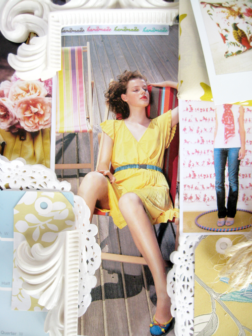
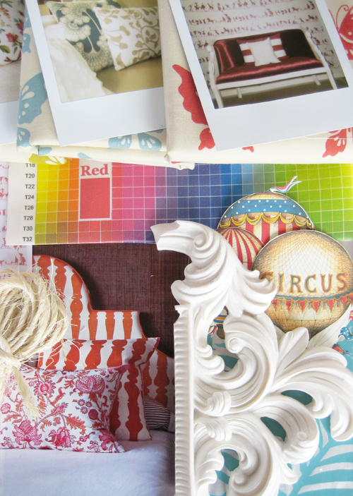
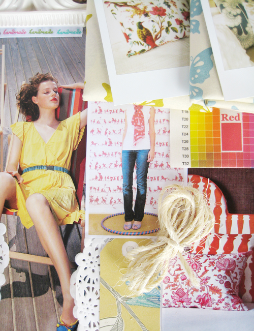
The weather is a bit miserable today (sun, where did you go?) but this inspiration board which I put together for Holly's BYW class that I'm taking has brightened up my day. I originally considered creating a neutral moodboard but if I am being true to myself it is colour that I adore.

I hope you are enjoying your weekend.


CREATIVE SPACES

DECORATING

DESIGN

INTERVIEWS

STYLE

TOURS

WRITE TO
PO BOX 42220
LUGARNO NSW
AUSTRALIA 2210

viv@ishandchi.com


VIA EMAIL