__________________________________________________________

About

Portfolio

My Home

Work With Me

Tours

Interviews

Creative Spaces

Style

Friday, April 29, 2011

Fashion Friday: A night in


Not as glamorous as my previous post however this is one of those outfits I like to wear when I am out and about or for lounging in at home after kicking off my heels for the day... to watch the royal wedding, of course!

Did you watch it too?

Thurley Spring/Summer 11/12 Preview


I would not blame my friends if they were embarrassed to go out with me. I tend to fuss over the interior of venues which is what I did when I attended the Thurley preview of their Spring/Summer 11/12 collection. Lucky I was flying solo this time!

The venue was the Woollahra Post Office and the interior a white canvas with gold ivy climbing the walls . It set off perfectly the designers' collection of flowing dresses and sparkly sequined suits. The red dress was a standout and my personal favourite. Gorgeous, isn't it?

Thursday, April 28, 2011

Student Showcase: Lighting


Just before I headed home from class tonight I popped my head into this showcase of lighting designs by students. It was surreal walking through the displays in the dimply lit space and I snapped photos of some of my favourites to share with you.

Monday, April 25, 2011

Fashionably Late Friday: Light denim. Red lipstick.


Light denim. Red lipstick. Love.

If only the sun wasn't going down when I took these photos. How I miss the long summer days!

Hope you had a wonderful Easter and Anzac Day.

Jeans: Phillips
Top: Sheike
Heels: Glamour Puss
Lipstick: MAC Russian Red

Pssssssst: I've setup a Facebook page where I'll be posting Fashion Friday outtakes. Click to have a peek: www.facebook.com/ishandchi.

Tuesday, April 19, 2011

Bamboo dining chairs have almost arrived


I'm alive! I have had a crazy week, some not very good news to deal with and just the general madness that is my life lately. Hope you have been well!

My new dining chairs will be delivered this week (see above) but I have been a little slack in choosing a dining table to match them with. I had narrowed down my choice to the Re-Trouve table that I wrote about in this post however I saw the table in person and as beautiful as it is I think it will be better suited as an outdoor table because of its metal top. Oh, the base is such a sexy shape though!

My next choice is the Heaven table also by KE-ZU. I think this will be the one unless you have come across any other tables I should consider?


And I am planning to top it all off with this light from Lightly most likely in white. I have seen a trend lately in wire lighting and although ordinarily I would be turned away by the thought of an exposed light bulb frying my eyeballs, I really like this lighting. The colours are fun too - it comes in red, yellow, white and black.

I'm open to your suggestions though!

Tuesday, April 12, 2011

111 Navy Chair Launch


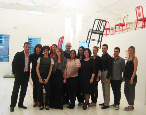
The other week I snuck off into the little streets of Chippendale to attend the launch of the 111 Navy Chair held at Corporate Culture. It was lovely to have been invited and I met some really warm and friendly people, including the Head of Emeco Gregg Buchbinder who was very giving of his time and happy to chat to all.

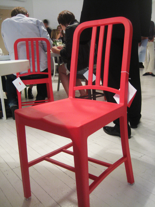
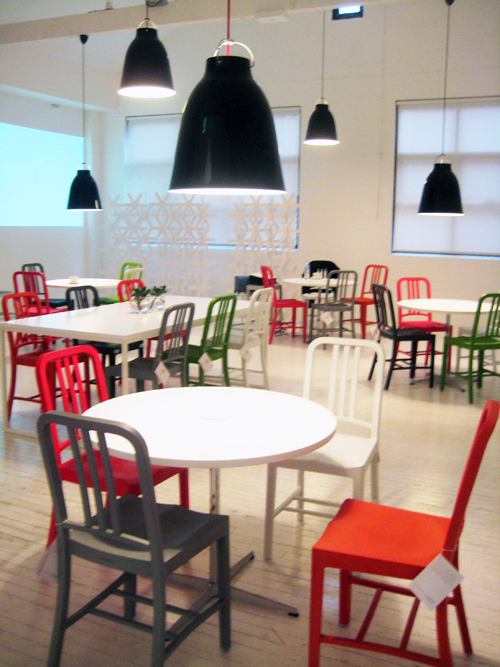
This new version of the classic Navy Chair is made of a minimum of 111 recycled plastic Coca-Cola bottles and it took 4 years of research to develop the tools and technology to create the chairs from this material. Gregg mentioned on the evening that one aspect of the project he likes is that the chairs have made more people think about sustainability and he is hoping to influence others to use up-cycled materials to create new products.

What do you think of these chairs and of the concept?

Saturday, April 9, 2011

Wednesday, April 6, 2011

School Project: Living Colour Kitchen


I'm feeling most unpleasant this week and trying my best to rest. If only you could see me now! Rugged up with a beanie and bed socks - so attractive!

Earlier this week I presented in class a concept mood board for a kitchen design. It is all about bringing the outdoors into the kitchen and playing with tightly bunched bursts of colour that can then be pulled apart to spread the colour about the room. Similar to pulling apart a fresh floral bouquet.

Who said kitchens had to be white?

Friday, April 1, 2011

My home in Adore Home - April / May


This was a lot of fun. When Loni Parker, editor of Adore Home magazine wrote to me to ask if she could feature my home I was thrilled! Each issue of the magazine is gorgeous. Have you been reading it? There are lots of links to international and Australian homeware and furniture stores which I LOVE.


(Click images to enlarge)

I am honoured to have my home featured in the previous issue (see here) and the current issue too. The photographer brought his son along to the shoot and Robbie made a new friend. Robbie showed them both around the house and then took his place in front of the camera saying 'cheese!'. That's my boy. Always ready to pose!

Loni, thank you so very much. Such a beautiful issue. What is your favourite part of it?

Please click on the images above to read the article and visit Adore Home to read the full issue.


CREATIVE SPACES

DECORATING

DESIGN

INTERVIEWS

STYLE

TOURS

WRITE TO
PO BOX 42220
LUGARNO NSW
AUSTRALIA 2210

viv@ishandchi.com


VIA EMAIL